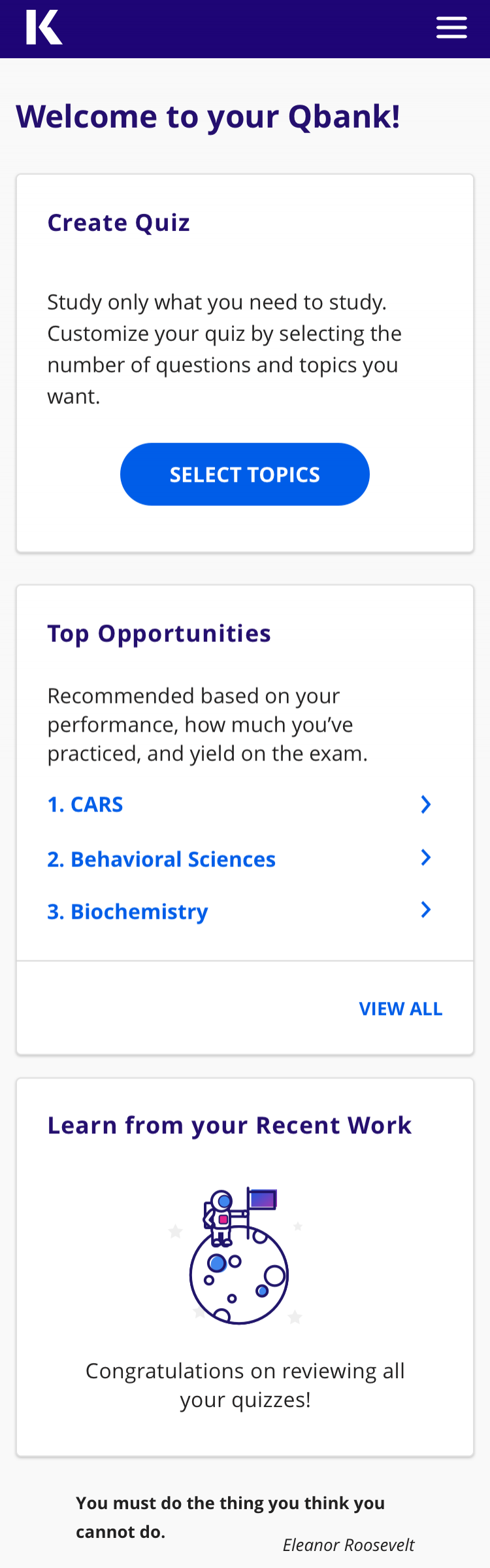
My main quest at Kaplan: increase engagement and usage of the LMS platform to increase the learning outcome in students.
In this project, I solved for engagement, usage and efficacy by creating a practice experience for students that was juxtaposed at relevant touch points in the student journey.
By blending the principles and practices of UX, product design, instructional design and learning sciences, I was able to create a measurable behavior change in the usage and efficacy of the platform.
I, also, helped retire a clunky legacy system and built out a brand new LMS platform, with a focus on: Streamlining the overall IA, simplifying the flows, building components for flexibility and modularity.

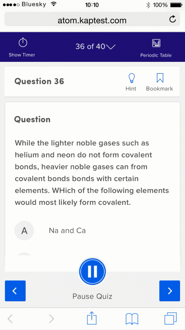
Principle Prototype of the Practice Experience
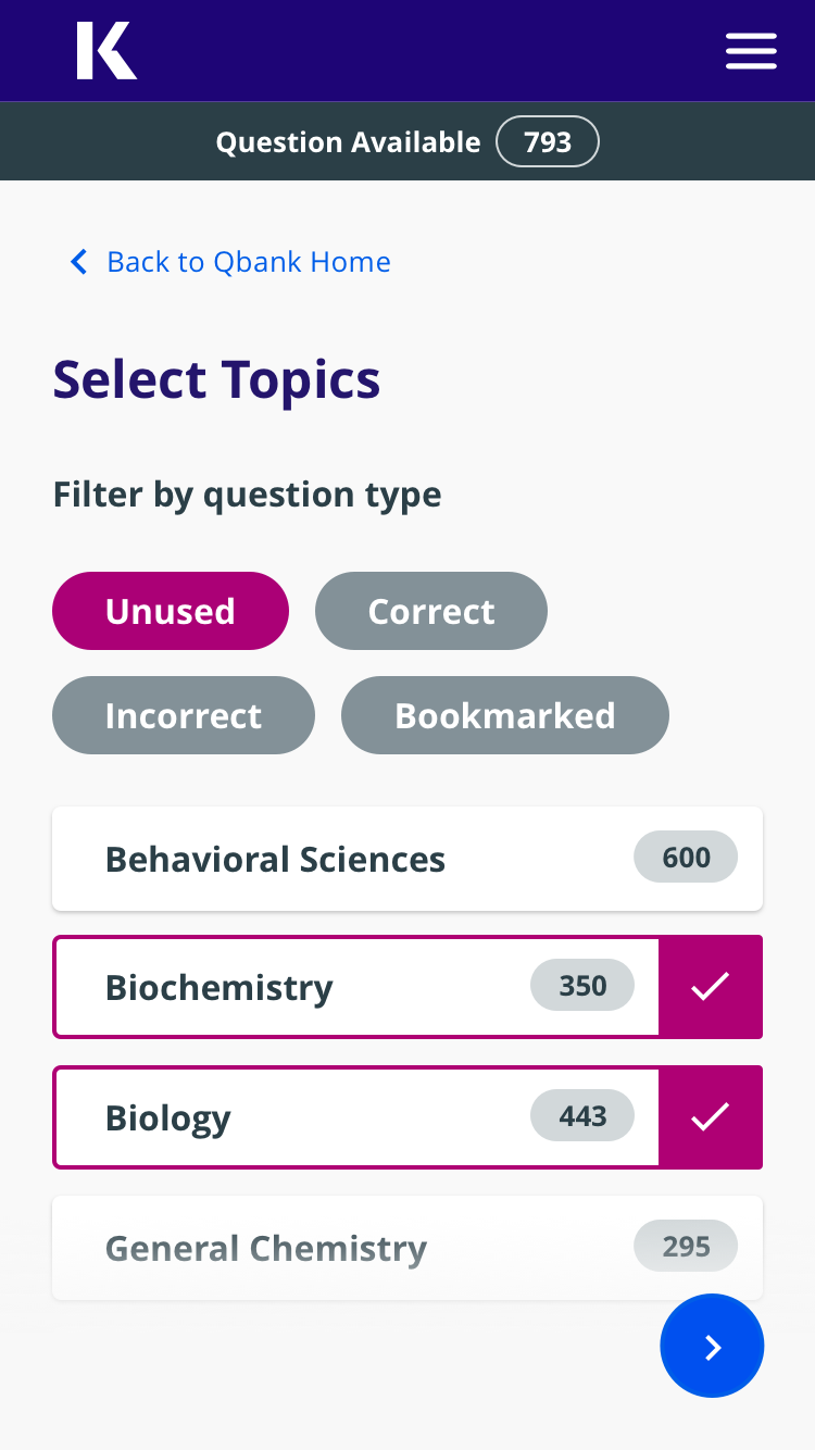
Practice Experience can be broken down in to the following modular tasks: quiz creation, quiz experience and quiz review and content review. Below is an interaction based prototype I created for this project. This prototype was made using Principle for mac.
This is a responsive projects, see samples of screens and interaction in the gallery at the bottom.

BEHIND-THE-SCENE
Every project is moulded by its design, development, team and organizational influences. While executing a traditional agile workflow for the delivery process, I kept the design strategy recursive and iterative by way of concept prototyping, continuous user feedback, A/B testing and data analysis.
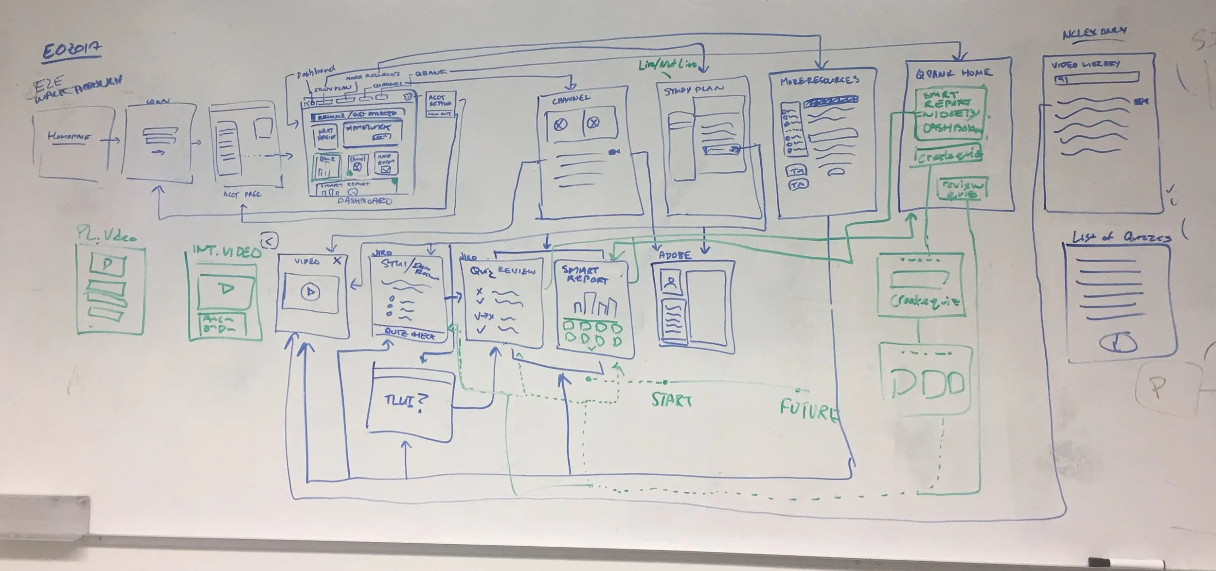
White boarding: Participatory design exercise with internal teams.
Harvesting Internal Knowledge
First off, I leveraged internal knowledge into a user flow. I used participatory design exercises with tutors, trainers, learning science professionals and students of Kaplan. These were short 30 mins sessions with pizza and beer incentives. This exercise created inclusion in my design process and helped me collect hypothesis to design and test. This process kept me from reinventing the wheel and saved time.
High-level user flow
Userflow
An immediate outcome to the participatory design exercise was this high level user flow that aimed to accomplish a few goals: aggregating requirements gathered from different teams and people, give developers an idea of how information will be organized (so they can begin POC work), do usability analysis to determine the UX foundation for the project. Key learnings:
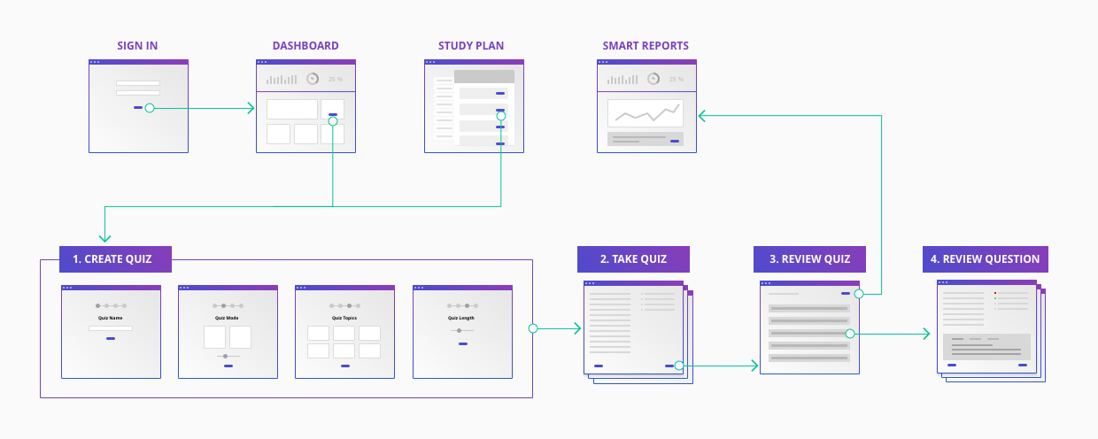
Task Flow
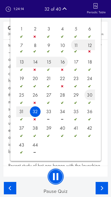
The quiz experience for optimum learning must entail three major tasks - quiz creation, quiz experience and quiz review.
Quiz Creation
Student's will create quizzes to learn subject matter that serves the specific need of that time - the quiz creation experience must entail a high degree of customization to match user expectation.
Since, the quiz creation task is not contributing to the actual learning in students, this task must be designed for simplicity and ease-of-use.
Quiz Review
The best learning outcomes are achieved when students review the quiz after submitting it. UX must create a habit loop of quiz creation, quiz taking and review for students to build a high learning outcome.
Increased amount of time spent reviewing a quiz is a measurable criteria for success for this project.

Responsive web user journey/screen flow.
Responsive Web Design
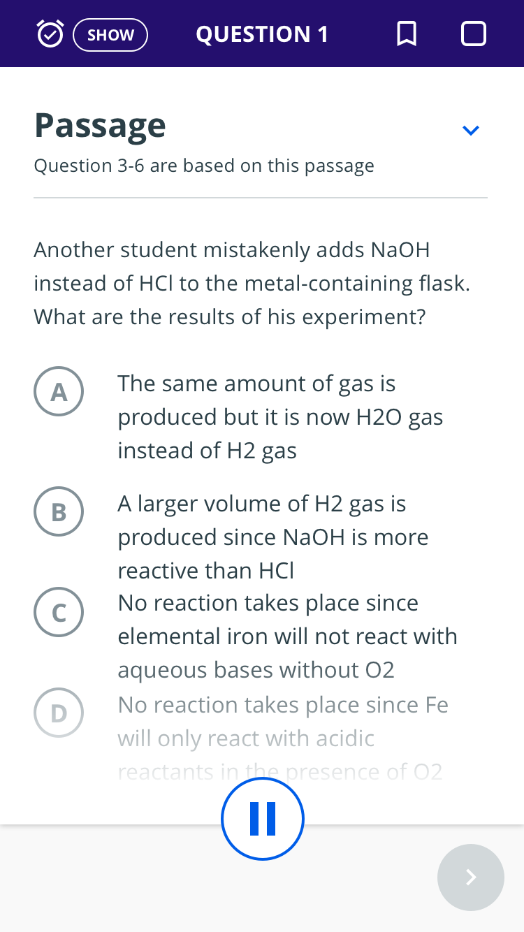
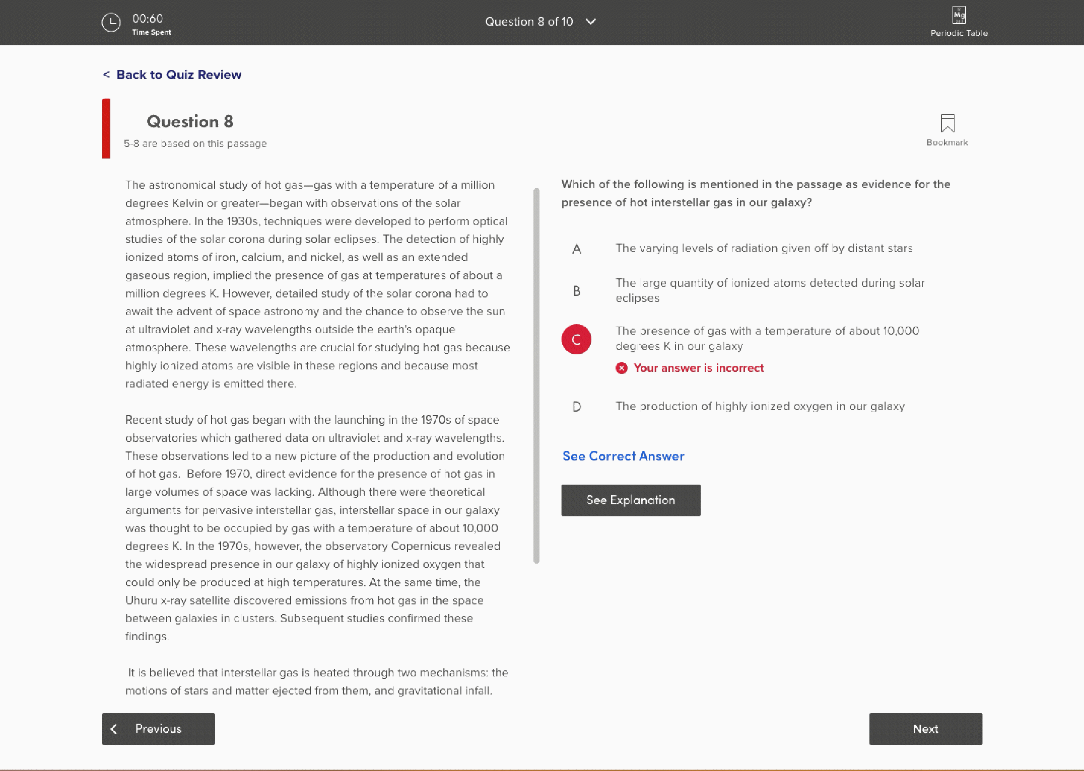
I uncovered that Test prep contains a diverse range of content. For example, there are 65 different question type that require unique layouts for content display and interaction types.
I hypothesized that users will find it hard to interact with test prep content on mobile screen as it can be very exhaustive and lengthy making small screen device usage cumbersome.
For example, passage based questions that require users to refer to a passage while answering questions would be cumbersome on the mobile screen. Quantitative data analysis revealed that quiz taking was not a traditional user behavior on mobile devices and saw only 10% of traffic when I tested a mock feature on the live site.
I worked with content teams to create a separate pool of content the application would use to serve questions for student using it on mobile devices. I wrote the content guidelines along with the content editors to incorporate mobile best practices and established tagging and taxonomy standards.

Screenshot of a testing session conducted using Lookback (my primary testing tool)
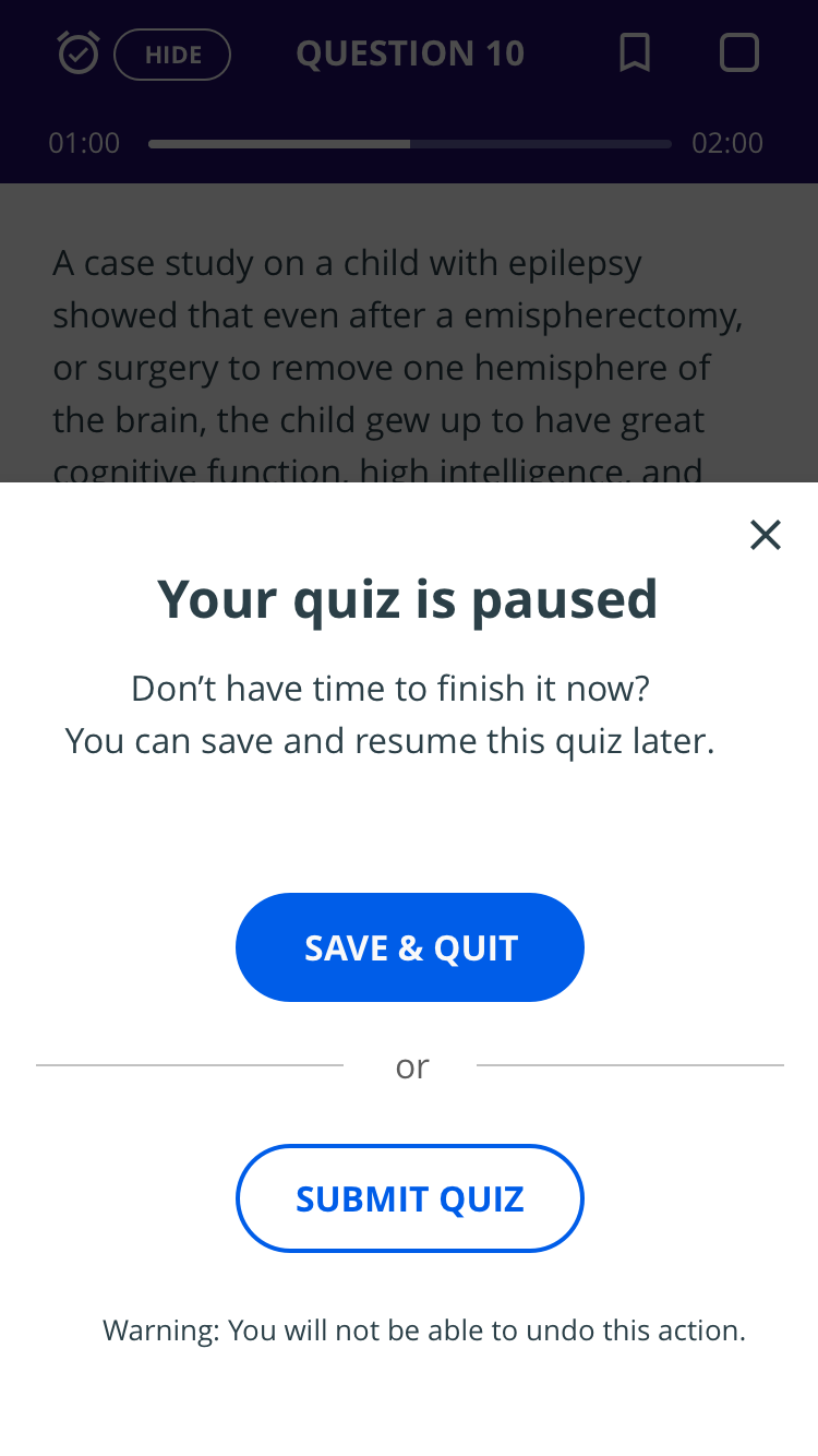
Prototyping & User Testing
I iteratively enhanced prototypes and performed qualitative testing with the user. The testing followed a traditional process of test planning, participant recruitment, test execution and team/org share out.
My team/org share out consist recommendations for improvement that undergo a round of scoping with product managers and engineers.
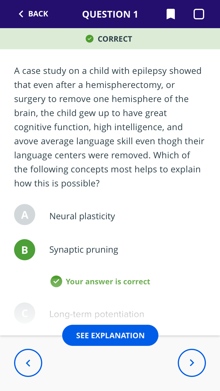
An insight from the testing session
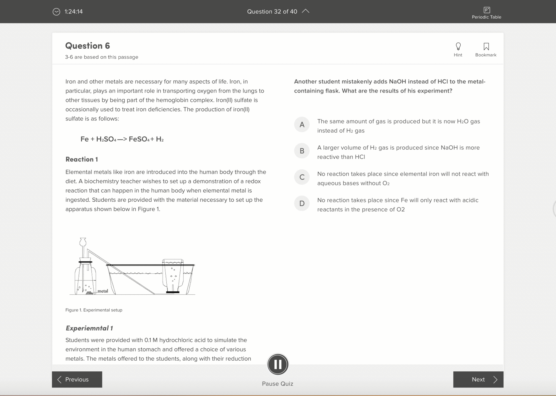
The quizzes use adaptive technology to deliver questions to the students, in which, a student's response to a particular question would determine the level of difficult of the next question. For example, if a student answers an easy Biology question, correctly, the next question served by the adaptive engine would have a relatively higher difficulty. This allows the technology to estimate the student's ability and further downstream in the student journey, it offers accurate recommendations.
Design implication of this was to constrain back and forth navigation between questions, so that the user cannot switch answers to the questions they have already interacted with.
What I found: Answer switching was a very common user behavior and was directly proportional to the student's self-confidence. Thus, there was a need to educate the student on what it meant to practice using an adaptive quiz.
Next steps: I worked around informational messaging to educate users on what to expect from the adaptive practice experience. I, also, started delegating and overlooking discovery projects on how to help students internalize the adaptive form of learning.
For more insights, get in touch with me: swatibahuguna@gmail.com

Reusable tab component: Screenshot of the living style guide component contributed by this project.
Components Library
I also helped build out the look and feel of visual components, creating a systematic and living Style Guide that improved workflow and served as a toolkit for consistent, clean UI across the digital experience.
UI & INTERACTION SAMPLES GALLERY
More available upon request. Please email swatibahuguna@gmail.com
Motion Sample: Question Review
Motion Sample: Hints and Bookmarking features